Real estate flyers that earn a callback share a short list of visual habits: one dominant exterior photo, a price and address that reads in the first second, and a contact block easy to find at a glance. This guide walks through each design principle, shows an annotated good-vs-bad comparison, and gives you a checklist and tool list you can use on today’s listing.
Flyer design principles for real estate listings
A well-designed listing flyer earns attention through three choices: a hero photo covering at least half the page, a price headline large enough to read first, and whitespace that keeps every element from competing with the others.
Visual hierarchy: lead with what buyers look at first
Hierarchy means the reader’s eye travels in a predictable order, from photo to price to address to features to contact. Design enforces that order through scale. The hero photo is always the biggest element on the sheet. Below it, the price gets the largest text, set bold so it registers before the reader consciously reads it. The address follows in the next text tier, slightly smaller. Feature bullets and the agent contact block come last and carry lighter visual weight.
A flyer that places the brokerage logo, the price, the photo, and the agent headshot at roughly equal size gives the eye no starting point. The reader scans without landing, and the flyer ends up in the trash.
Photo selection: one hero, then supporting shots
The exterior shot is the hero on almost every listing flyer, because it is the image a buyer pictures when they think of the address. Choose the sharpest available exterior, taken in good light with the lawn trimmed and no cars in the driveway. Crop it so the front door or the most distinctive architectural feature sits at center.
Interior shots work well as secondary images in a two- or three-photo layout, but they shrink to thumbnail size on a letter flyer and lose the detail that makes them compelling. Use interiors as accent images only, below the hero.
Whitespace: the margin that makes everything readable
Whitespace is the empty space around and between design elements. It tells the eye which groups belong together and which are separate. Set a minimum outer margin of half an inch on every side and leave at least 12 to 18 points of space between each column, image, and text block.
Agents new to design often treat whitespace as wasted space and fill it with additional bullet points or a second photo. The result reads as busy and takes more time to process than a buyer stopping at a sign box will spend.
Good vs. bad real estate flyer examples, annotated
A good listing flyer places the hero exterior photo across the top, sets price and address in bold on the second visual tier, runs a short feature list in the middle, and anchors the contact block at the bottom. A crowded flyer stacks six equal-size photos, runs four typefaces, and prints a 200-word description across the center.
What the good example does right
The hero exterior fills the top 55 to 60 percent of the page. Below it, the price appears in large bold text, flanked by the bed count, bath count, and square footage in a horizontal stat row. A two-column bullet list of five to seven standout features follows. The agent headshot, name, phone, and brokerage name anchor the bottom strip. Every element has a clear lane and the reader hits each in order.
What the bad example gets wrong
Six equal-size interior photos create a grid where no image dominates. Four typefaces (a serif headline, a sans body, a script accent, and a bold brand font) each demand separate attention and none wins. The property description runs in 9-point type across two columns and requires more reading time than a passing buyer will spend. The agent phone number appears once in an 8-point sidebar.
| Design choice | Good flyer | Cluttered flyer |
|---|---|---|
| Photo hierarchy | One dominant exterior hero photo covering about 55 to 60 percent of the page | Six equal-size interior photos with no clear lead image |
| Price and address | Price in the largest type, address directly below, specs in a clean row | Brokerage logo, sidebar copy, or decorative text competing with the price |
| Typography | Two typefaces maximum: one heading and one body face | Three or more typefaces fighting for attention |
| Feature copy | Five to seven short bullets, each under ten words | A dense paragraph property description in small type |
| Contact block | Agent headshot, name, phone, email, and brokerage in one bottom strip | Agent details split across multiple locations or set too small to read |
| Export quality | 300 DPI print export and compressed PDF for email | Low-resolution screenshot crops or blurry portal images |
Quick-start checklist for your first real estate flyer
These seven steps produce a print-ready listing flyer in under thirty minutes, whether you start from a blank canvas or a pre-built template.
- Select one exterior photo as the hero (sharp, level, taken in good natural light)
- Set the hero image to fill at least 50 percent of the page
- Write the price in the largest text on the sheet (48 to 60 points, bold)
- Add the address one line below, at 24 to 36 points
- List five to seven property features as bullets, each under ten words
- Place your agent headshot, name, phone, and email in one block at the bottom
- Export at 300 DPI for print; export a compressed PDF under 5 MB for email
Compliance check before printing
Before printing or distributing a listing flyer, run a brief compliance review.
- Brokerage name and affiliation: The NAR Code of Ethics requires the brokerage name to appear clearly and conspicuously on all advertising. Both the agent name and the brokerage name must be present.
- Equal Housing Opportunity: Including the Equal Housing Opportunity logo or the statement “Equal Housing Opportunity” on residential listing materials is a HUD-recommended best practice that demonstrates compliance with the Fair Housing Act.
- State license number: Some states require the agent or brokerage license number on advertising materials. Check your state real estate commission rules before going to print.
- Brokerage approval: Many brokerages require listing flyers to use an approved template or pass a compliance review before distribution, particularly for direct mail and large print runs. Confirm the process with your broker before the flyer goes out.
Common real estate flyer design mistakes and how to fix them
The most common flyer design mistakes are three: too many typefaces, a hero photo too small to carry emotional weight, and a contact block split across the layout or set in type too small to read at arm’s length.
Too many typefaces
Using three or more fonts on a single flyer creates visual competition where no element reads cleanly. Limit the design to two: one bold face for the price, address, and section headings, and one neutral face for bullets and the contact block. A reliable pairing is a geometric sans-serif such as Montserrat, Lato, or Open Sans for display text and the same family at regular weight for body copy.
A hero photo that is too small
A photo strip across the top quarter of the page leaves the property too small to feel real to a buyer. Increase it to fill at least half the page. If the available listing photos are low resolution, use the highest-quality file on hand. For print, target 300 DPI at the final print size. For digital and email, pixel dimensions matter more than DPI settings: export at 1080 by 1080 pixels for square social, 1080 by 1920 for vertical, and a compressed PDF under 5 MB for email delivery.
A contact block that is hard to find
Splitting the agent name, phone, and email across the header, sidebar, and footer makes it harder for a buyer to act after reading the flyer. Pick one location (the bottom strip is conventional and the eye ends there naturally), make the phone number at least 12-point type, and add a QR code linking to the listing if space allows.
Paragraph descriptions on a print piece
The full MLS write-up belongs in the listing. Use the real estate listing descriptions guide to draft the MLS copy, then distill it to five to seven bullets for the flyer. Each bullet should name one specific feature in under ten words: “Chef’s kitchen with quartz counters and gas range” works; a two-sentence description of the kitchen does not.
Tools to design a real estate flyer faster
The fastest design path combines a pre-built template with a tool that fills in property data automatically, so you replace photos, confirm the facts, and export rather than starting from a blank canvas.
Canva
Canva offers a large library of real estate flyer templates pre-sized for letter print, half-letter, and social sharing. The drag-and-drop editor handles photo swaps, text edits, and color changes without design experience. The paid plan includes a brand kit that locks your fonts and colors across every template, so every listing flyer stays on-brand without rebuilding the look from scratch. Carrying the same brand colors into your listing video title cards keeps print and social assets visually consistent across every campaign.
Your brokerage’s co-branded template library
Most national brokerages maintain a template portal with co-branded listing flyers. These often connect to the MLS and pull the listing data automatically, which removes the risk of a typo on price or square footage. Check your brokerage intranet before building a flyer from scratch.
A dedicated real estate flyer guide
Tools built for listing flyers pull photos and facts directly from the MLS, drop them into the layout, and output a print-ready PDF in one step. They skip the blank-canvas design phase entirely and are worth the subscription if you produce flyers for more than a few listings a month. The create a real estate flyer guide walks through the same workflow manually.
A photo-to-video editor for listing video alongside the flyer
A listing flyer covers print, brochure boxes, and email. A listing video covers social media, your website, and text message follow-up. A free editor such as CapCut takes the same exterior and interior photos you already have for the flyer, animates them with motion, takes a short voiceover with the property facts, and exports three formats: 9:16 for Reels, 1:1 for the feed, and 16:9 for your listing page. Both the flyer and the video draw from the same photo set, so producing them together adds little to the listing prep workflow.
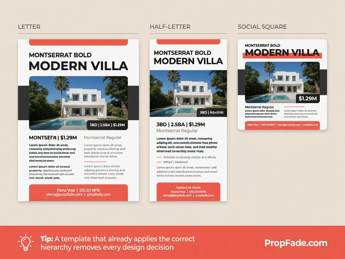
Real estate flyer templates that follow these principles
A template that already applies the correct hierarchy, photo sizing, and font pairing removes every design decision except entering the listing details, so the only variable is the property itself.
A well-built template set includes at least two print sizes: letter (8.5 by 11 inches) for sign boxes and direct mail, and half-letter (5.5 by 8.5 inches) for brochure holders at the property. The half-letter size prints two per sheet, cutting paper cost in half on large runs. For open house materials, applying the same visual system to the feature sheet and the open house flyer creates a consistent on-site presentation that reinforces your brand at every touch point.
Matching social crops (a 1080 by 1080 square and a 1080 by 1920 vertical) round out the set so one design decision covers print, email, Instagram, and Facebook. The visual consistency signals professionalism to buyers before they have read a single word.
The real estate flyer template library covers both print sizes in multiple styles. The real estate flyer hub covers the full workflow, from design through print to digital distribution.
Frequently asked questions
Choose one strong exterior photo as the hero and set it to fill at least half the page. Add the price in large bold text (48 to 60 points) and the address below it, list five to seven feature bullets in the middle, and place your contact block at the bottom. Use two typefaces and leave a half-inch margin on every side.
A good real estate flyer has a single dominant hero photo, a price and address visible in the first glance, a short bullet feature list, and one readable contact block at the bottom. It uses two fonts, a white or off-white background, and enough whitespace that no section crowds another.
A listing flyer should show the best exterior photo across the top half of the page, the price and address in bold immediately below, a two-column bullet list of five to seven features in the middle, and the agent name, photo, phone, and email anchored at the bottom. Standard print size is 8.5 by 11 inches for sign boxes and direct mail.